This is your Project Page. It's a great opportunity to help visitors understand the context and background of your latest work. Double click on the text box to start editing your content and make sure to add all the relevant details you want to share.
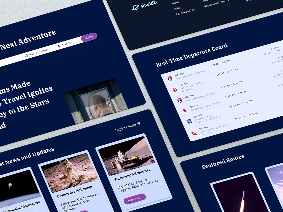
Shuddle Design System Case Study
As a part of Scaling Design Systems course by Dan Mall we were tasked to create 3 products powered by the same design system. Along the way we had an unexpected plot twist which you can learn about by reading this case study. Stay tuned!
Project Brief
From the very beginning of the project, I was assigned the role of the Head of Digital for the newly launched IPTS: the Interplanetary Travel Syndicate, a bustling transportation network that shuttles people from world to world within our galaxy.

The leadership of the company has decided to launch 3 unique offerings:
-
ipts.org, an informational website where you can find the latest news and happenings with the IPTS
-
IPTS Travel, a website where you can browse and book travel to and from multiple destinations within our galaxy.
-
IPTS Rail, a real-time updated web app where you can view lines, routes, and times for all the different commuter lines.
The goal was to create all three products along with a scalable design system. The overall timeframe for the whole project was 2 weeks which I thought would be more than enough at first. However, I wasn't aware that more surprises were coming up during the second week...
Pilots
The first step of any design system is to actually have a pilot, an initial product to create from.
Since I only had 2 weeks on the project, I didn't have enough time to do proper research. I started by getting some design inspiration from various websites.

I used ChatGPT for helping to form a layout for each of the products. This was my base for creating low-fidelity wireframes prior to moving to proper prototypes.


Color & Typography
After creating a foundation for my upcoming pilot it was time to create a Style guide that included Color System and Typography.


IPTS Websites
This preparation of lo-fi wireframes, typography, and color system helped me in creating high-fidelity layouts. I used some of the inspiration from the moodboard above and came up with dark-themed designs that remind me of the NASA website but my own updated version of it.
ipts website

IPTS Travel
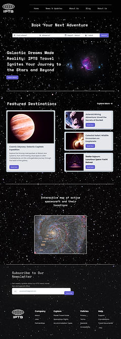
IPTS Rail

Components Library
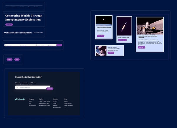
Using visual inventory, I collected all repeated UI elements across the three websites and created a design system. Due to the very limited timeframe, it wasn't possible to create an extensive version of it but rather a limited one with all the necessary components that can be reused on all three products.

Plot Twist
Initially, the goal of mine for the given two-week timeframe was to spend more time on the design system for IPTS products and make it more extensive and deep. However, after the first week of the project, we received some interesting news:
"Your leadership at the IPTS—the Interplanetary Travel Syndicate—just hired the prestigious branding firm MegaBrand to do a rebrand of the entire organization, and there are a few things that’ll affect the three products you’ve been working on.
MegaBrand discovered through focus groups that the IPTS name and logo felt very ominous like it was a cold, faceless corporation that was always watching. (“The eyeball-shaped logo doesn’t help,” said one candid participant.) In addition, the IPTS wants to appeal to a younger demographic.
After weeks of research and exploration, they’ve settled on the new name “Shuddle,” which feels more like a cool, new startup."

The 3 main products have also been renamed to feel more like a family of products instead of independent offerings:
-
“ipts.org” is now “shuddle.world.“
-
“IPTS Travel” is now “Shuddle Visit”
-
“IPTS Rail“ is now “Shuddle Ride“
Updates
The good news was that the color palette was provided and it looks fresh and vibrant, and the identity relies much more heavily on photography of younger people to feel more welcoming and inviting.
I updated the Color system library to make the shift from IPTS brand to Shuddle brand more efficient.

Fonts were also provided by the leadership of the company. The typographic palette relies heavily on the IBM Plex superfamily to both give a wide range as well as make everything feel familiar. Here is the updated typography section as well.


Component Library Updates
The rebranding challenge was the ultimate test to see how easy it was to update an existing design system to the new requirements that occurred. In my case, it was pretty straightforward because my components were reusable and scalable. I even spent some time refining some of the components to make them more aligned with the new branding.
Before & After
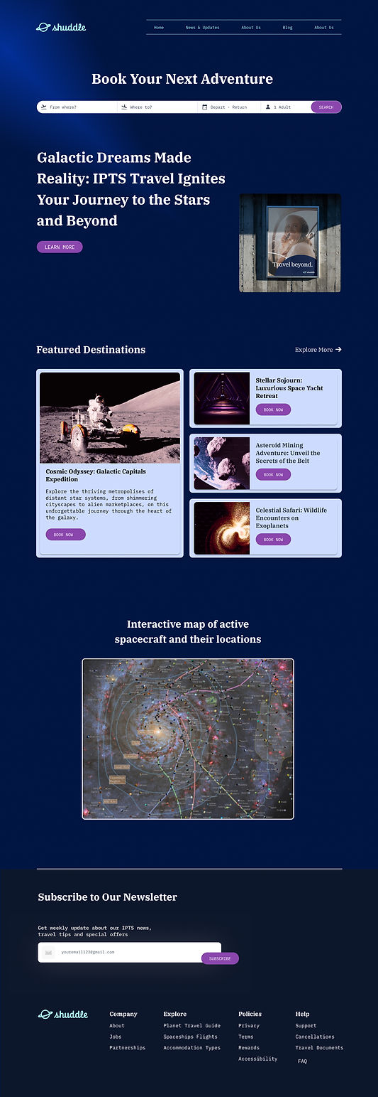
After updating the design system which included the swap of colors, typography, and some minor design changes an updated website came to life - a vibrant, modern, energetic, and radiant product that is more attractive to the younger generation.
Before

After


Reference Website Documentation
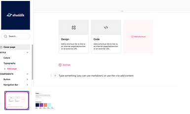
Detailed documentation with all the descriptions of the main components and their usage was created on Zeroheight. The importance of reference website documentation cannot be overstated. It serves as a connector within the team which helps to maintain consistency and collaboration, resulting in the seamless evolution of design systems.
Here below is just a small portion of how the documentation was done for the whole product.

Final Thoughts
During this two-week project, I experienced an extremely concentrated example of the rapid product requirement changes that frequently happen in the daily work life of a UX designer. I must admit that it was very unusual and stressful at times to experience it in such a short period of time. However, as an experienced UX designer, I've seen my fair share of clients and stakeholders switching things up. I felt good to be able to apply my skills and expertise to this project.
I really enjoyed the challenge as it revealed the areas where I need further improvement and skill development and those in which I excel.
Key Takeaways:
-
Design system is a significant help in scaling the product, streamlining the development process, and ensuring consistent and user-friendly experience across all the products.
-
Learning more about design tokens and variables helps with maintaining consistency, facilitating efficient design updates, and fostering collaboration.
-
Creating reference website documentation is a must during the work on design systems since it fosters collaboration, consistency, and scalability. It makes the whole design system more efficient and scalable.
